Well this week marks the third week of my Powdertown Series and that means we are half way through the series. Hopefully you have been following along and didn't miss out on
Chatfield Park or
Fowler's Apple Tree. If you did go ahead and take the time and get caught up.
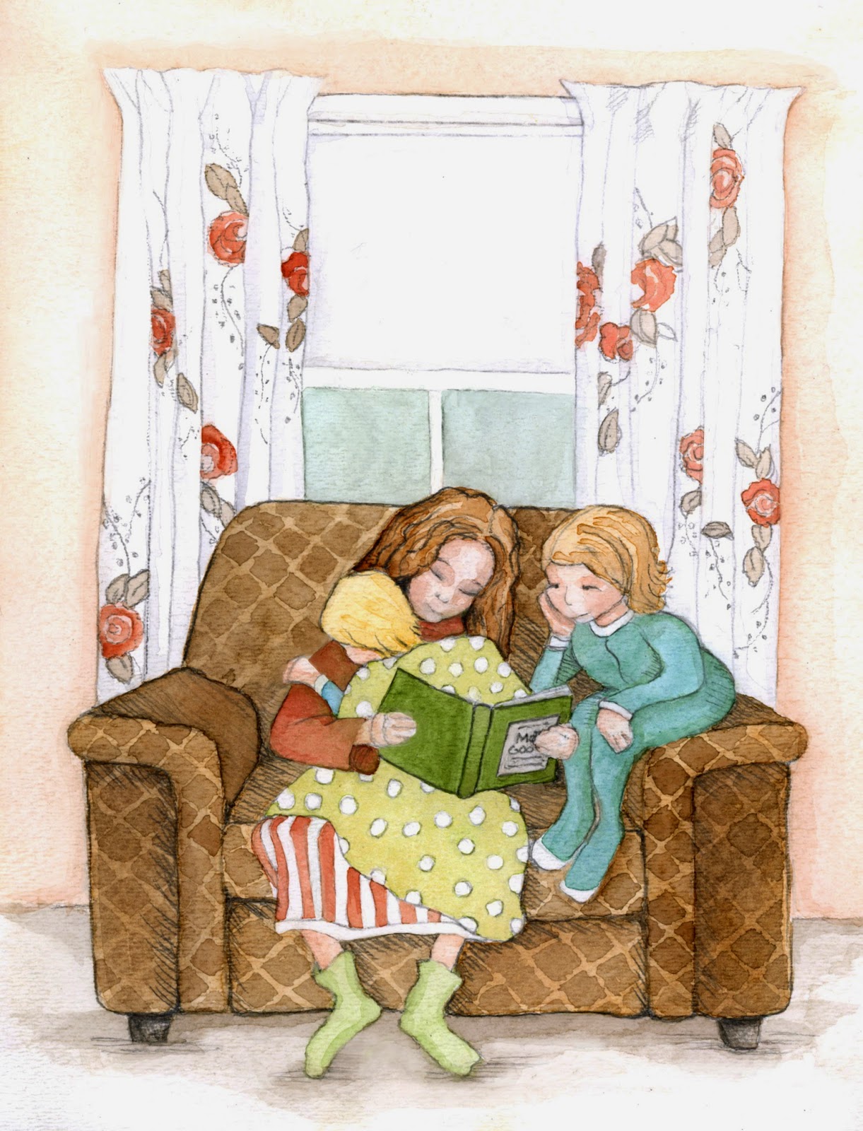
There is nothing that feels quite like home so much as a comfortable arm chair. It welcomes you with soft silent strength and then quietly whispers, "home, home at last!" Like any other home, we would have chairs "wear out", and then they would be replaced. In my life there has been a parade of chairs, and for what ever reason this "brown chair" has parked itself in my memory banks.
 |
Powdertown Series:
Brown Chair |
I remember every thing about it. It's wide flat side arms that could serve as extra seating, the raised diamond textured pattern, the soft extra wide cushion that could fit two or three of us kids. I remember curling up on it with pillow and blanket for afternoon naps while Mom would watch her "stories." But perhaps my favorite would be throwing a quilt over the top and creating a tent which would mean hours upon hours of fun! Tell me why everything became more fun under that tent.
During this series I have really only talked about imagery, and have not said much about my process, so let's talk "color schemes". I wanted these six illustrations to have some unifying elements that would help say, "hey, we belong together" and I felt the best way to create that is through a color scheme. So before I started to paint, I went shopping for a color scheme. Now I had to take a few things into consideration such as what colors needed to be represented, I needed to include a coral for the drapery, brown for the arm chair, a teal blue (you will see why in a few weeks), and a nice green for all of the outdoor scenes.
Now you can shop for color schemes in many places, a favorite painting, a photograph, or fabric. My favorite place would have to be
Adobe Kuler. Kuler is an awesome site where you can can find thousands of color palettes or just simply create your own to use in your next design project. Best part is that you can upload any color palette into your Adobe Creative Software and it will become part of your color swatch library...how cool is that I ask? However, since my illustrations were not done digitally, I simply took a screen shot of my color palette and printed it off. I kept it at my art table as a reference while mixing my pools of paint. The color palette I chose is called "Everyday Veggies", look it up if you like.
Thanks so much for taking time out of your busy schedule.....I really do appreciate it. Take care until next week.


